Company & Role
Expedia Group Multifamily Solutions (EGMS) is a subsidiary of Expedia Group, focused on connecting the apartment industry to short-term rentals through various tools and services.
As the sole designer, I led the user experience for two customer-facing tools (Flex Manage and Flex Travel), an internal tool (Flex Backoffice), and the marketing website, which I built in Webflow. My responsibilities spanned the entire design process, from discovery to visual design and development handoff.
Product Transformation
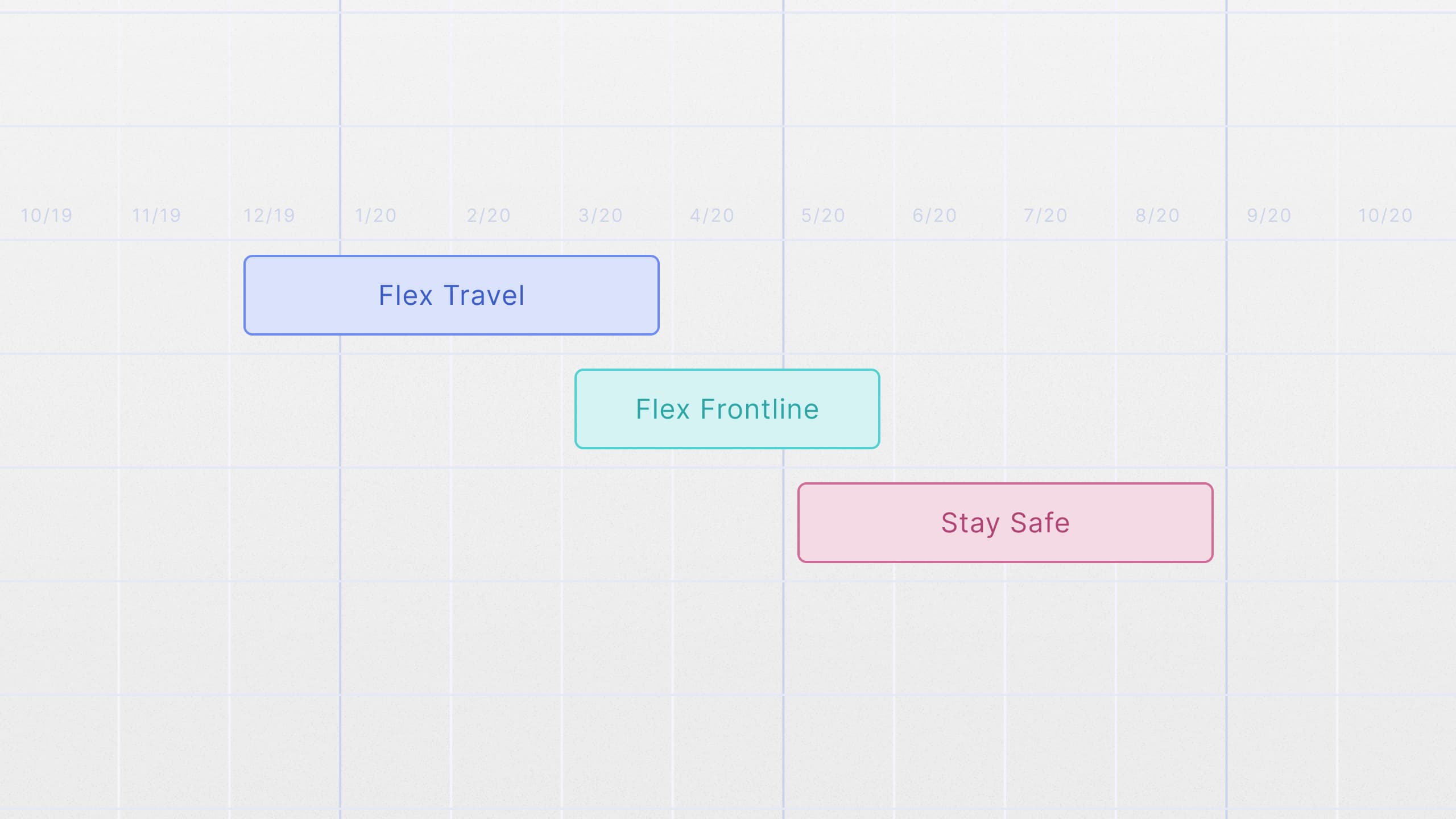
Originally, Flex Travel was designed to allow tenants and employees to travel between properties at discounted rates. However, during the COVID-19 pandemic, the product pivoted to serve a different purpose. It became Stay Safe, a platform that helped frontline workers find affordable lodging through Expedia's partner network. This transformation required adapting both the user experience and product architecture to meet urgent new needs.
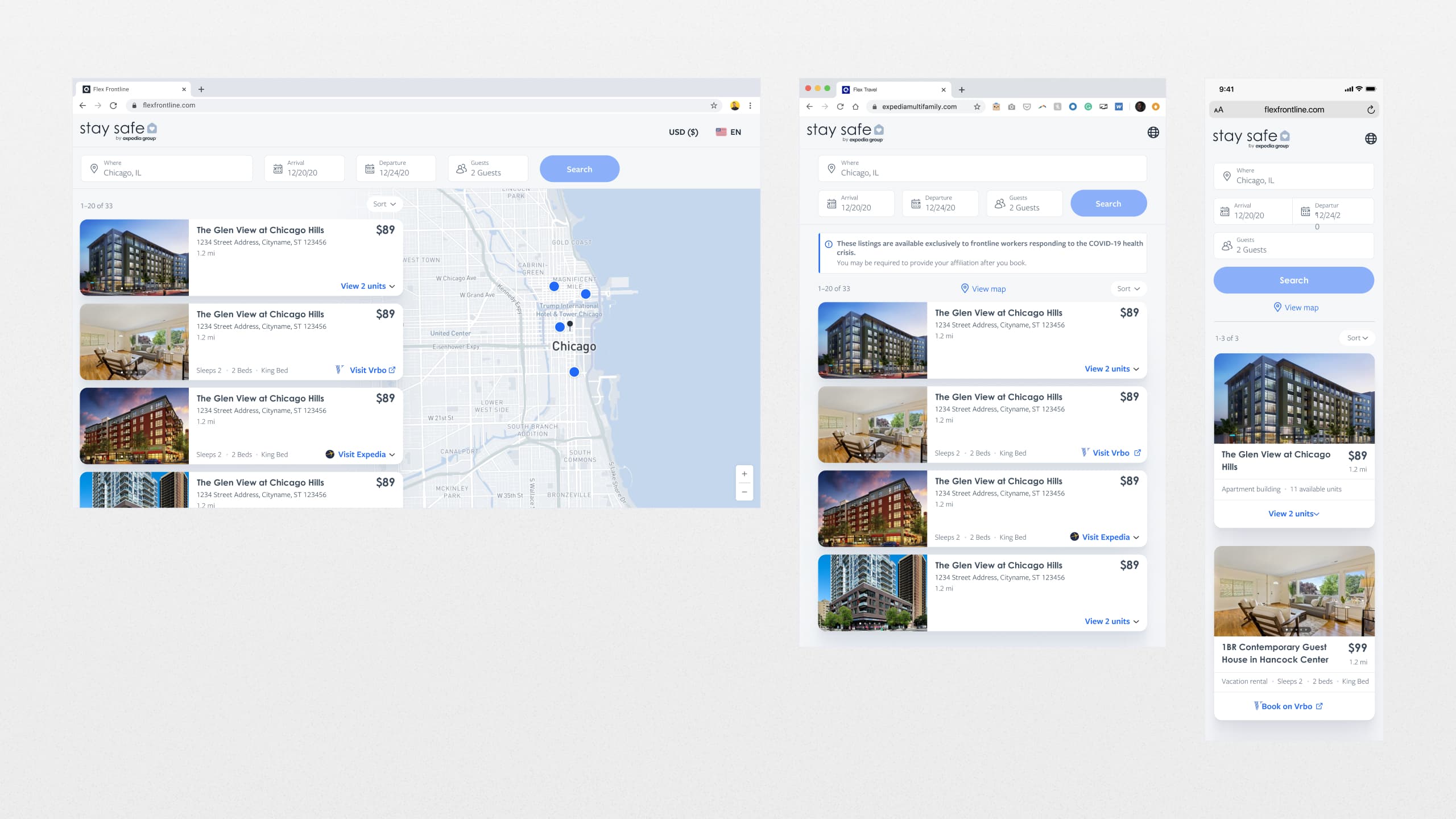
Problem & Discovery
Problem: How can we create a seamless experience that enables tenants and employees to travel between properties at below-market rates?
To kick off the design, I collaborated with the product and engineering teams to define business goals, user pain points, KPIs, and constraints. By analyzing competitors like Airbnb and VRBO, I identified design patterns that users were already familiar with, such as search, results, and checkout flows.
Mapping Flows & Wireframing
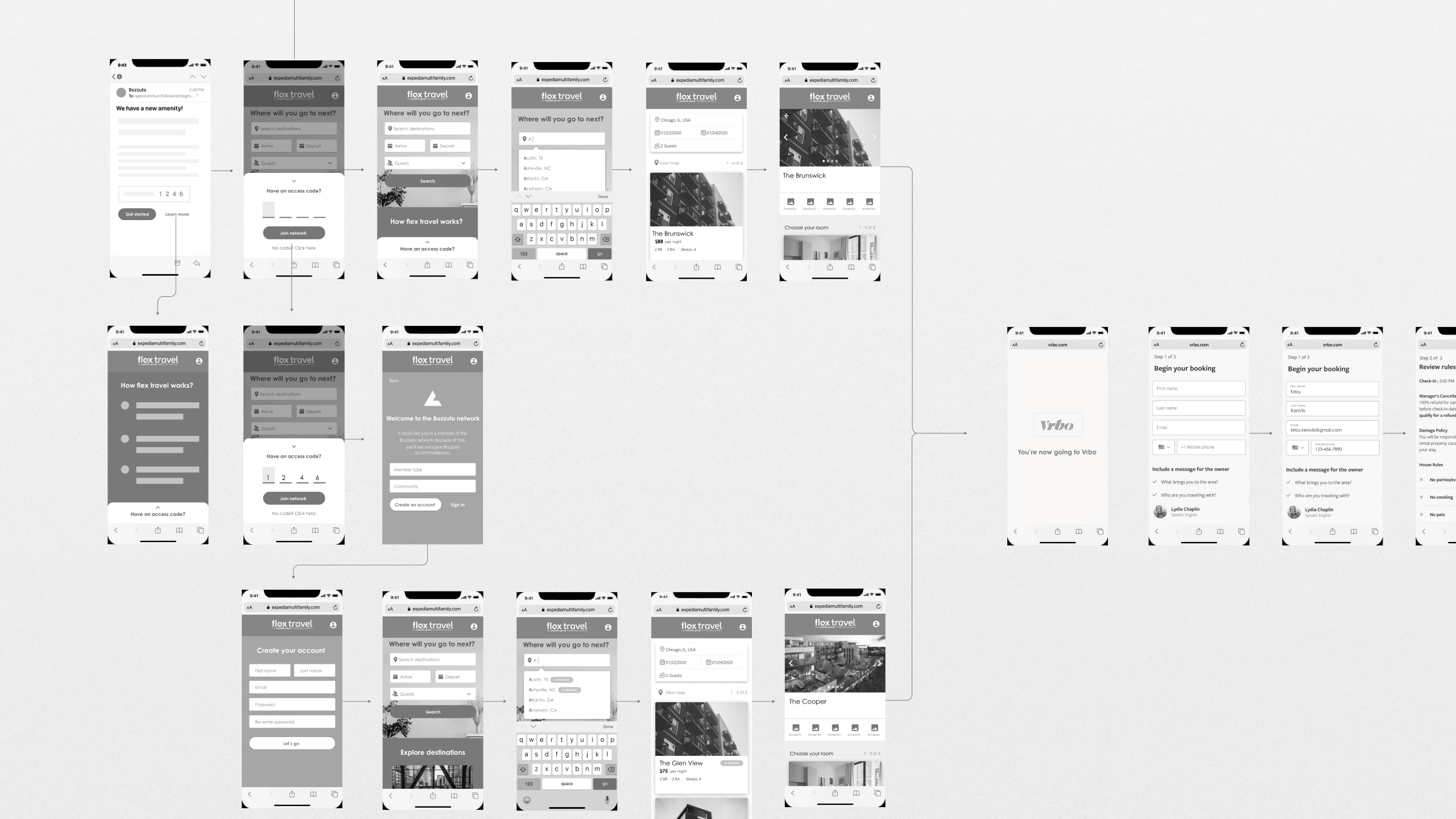
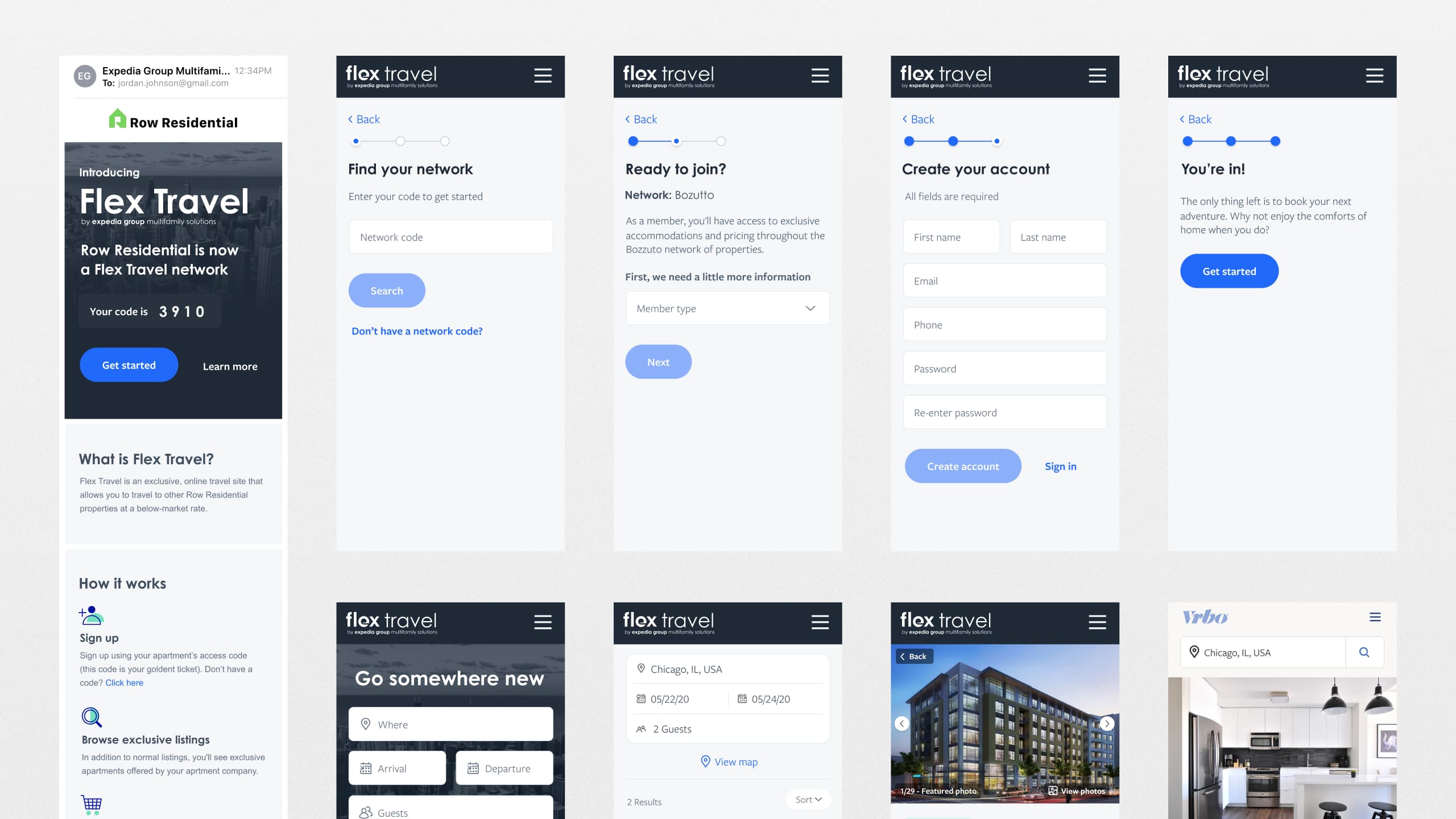
After defining our goals and user needs, I started by mapping out the user flows, ensuring that each step of the journey — from sign-up to booking — was streamlined and intuitive.
I created a series of low-fidelity wireframes to explore key screens and interactions, focusing on user flows like sign-up, search, and handoff. These wireframes were shared with the product and engineering teams to iterate quickly and ensure alignment on core features before moving to high-fidelity designs.
Communicating Value to Users
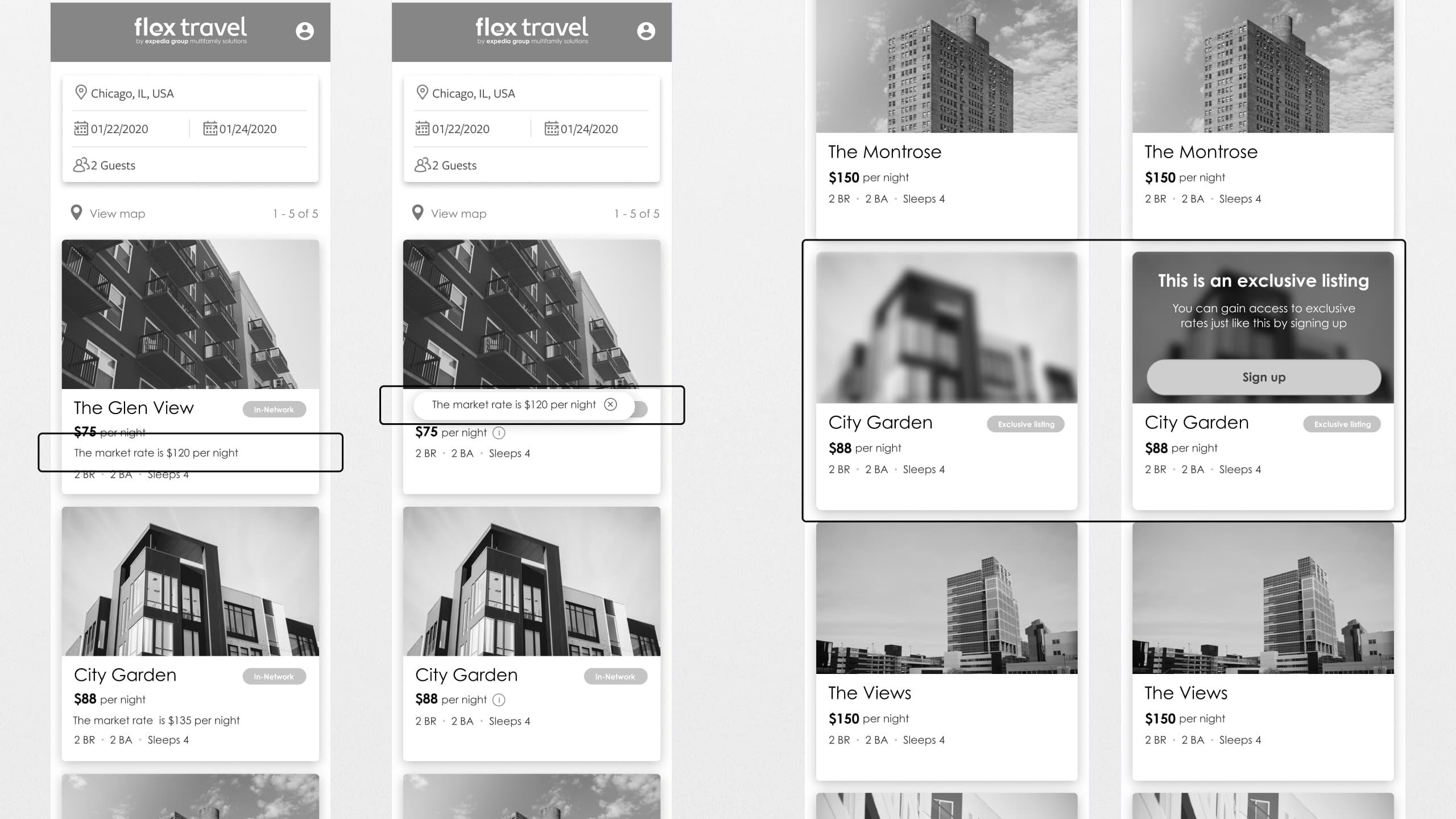
We needed to communicate the value of exclusive discounted rates clearly, especially for new and returning users.
For verified users, I introduced a comparison of market rates using the AirDNA API, displayed alongside in-network prices to emphasize the value of our discounted listings without using misleading discount tactics like strike-through pricing. For unverified users, we allowed them to preview the platform's value by letting them browse regular listings while blurring out a few exclusive discounted listings as a subtle nudge to sign up.
Visual Design & Implementation
Once wireframes were validated, I moved into high-fidelity visual design. We customized Expedia's design system to suit Flex Travel's unique identity, adjusting colors, typography, and UI components while maintaining alignment with Expedia's brand.
Using the MoSCoW method, we prioritized essential features for the MVP launch while planning for long-term enhancements. I provided detailed specs and design documentation to ensure smooth implementation.
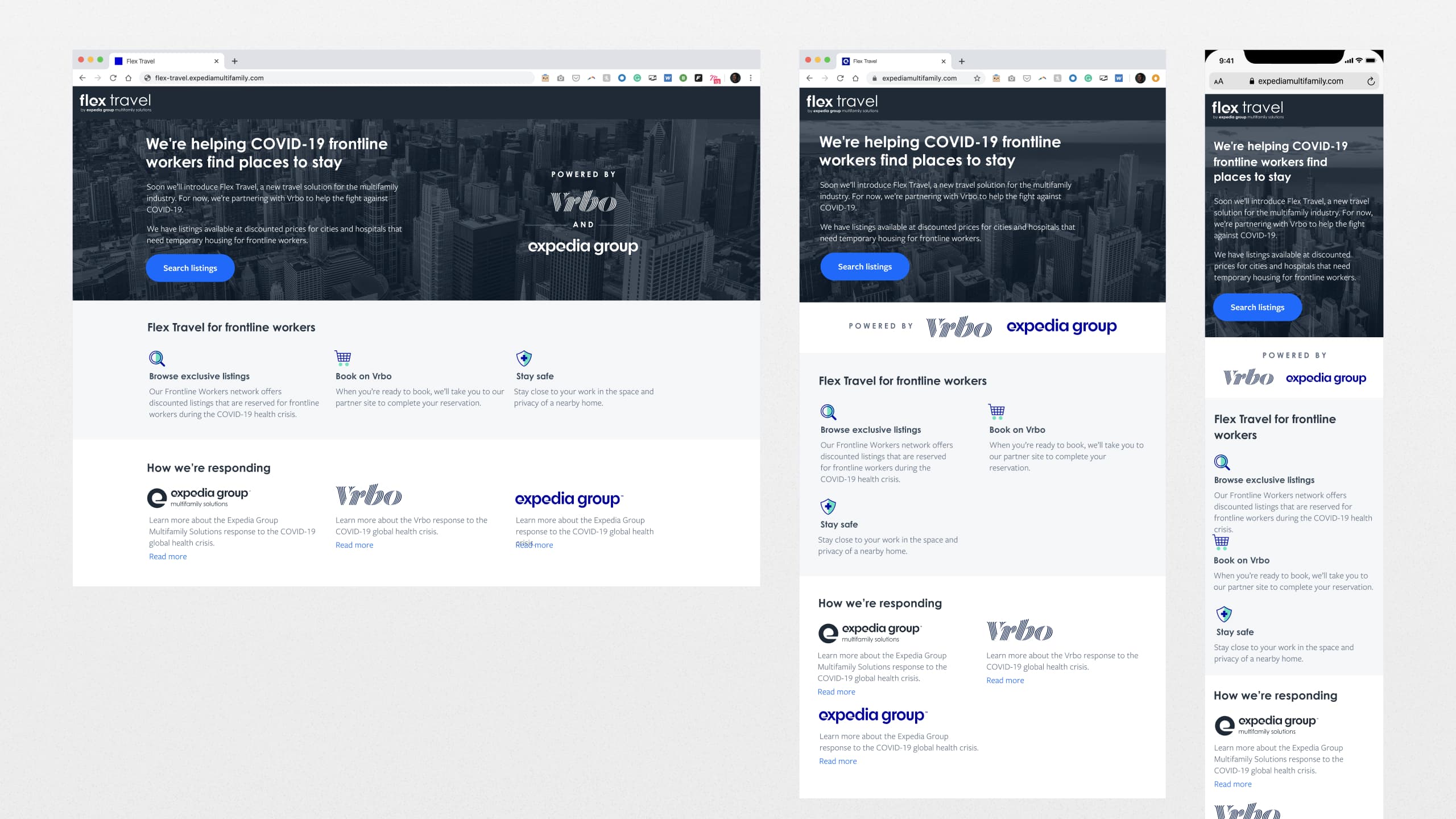
Flex "Frontline" Pivot
When the pandemic hit and travel demand plummeted, we pivoted from Flex Travel to Flex "Frontline" (internal name), a tool designed to help frontline workers find lodging quickly. Within one week, we adapted the platform and launched the new version, thanks to close collaboration across product, design, and engineering. The success of Flex Frontline attracted the attention of Expedia leadership, who explored its potential as a global crisis-response tool.
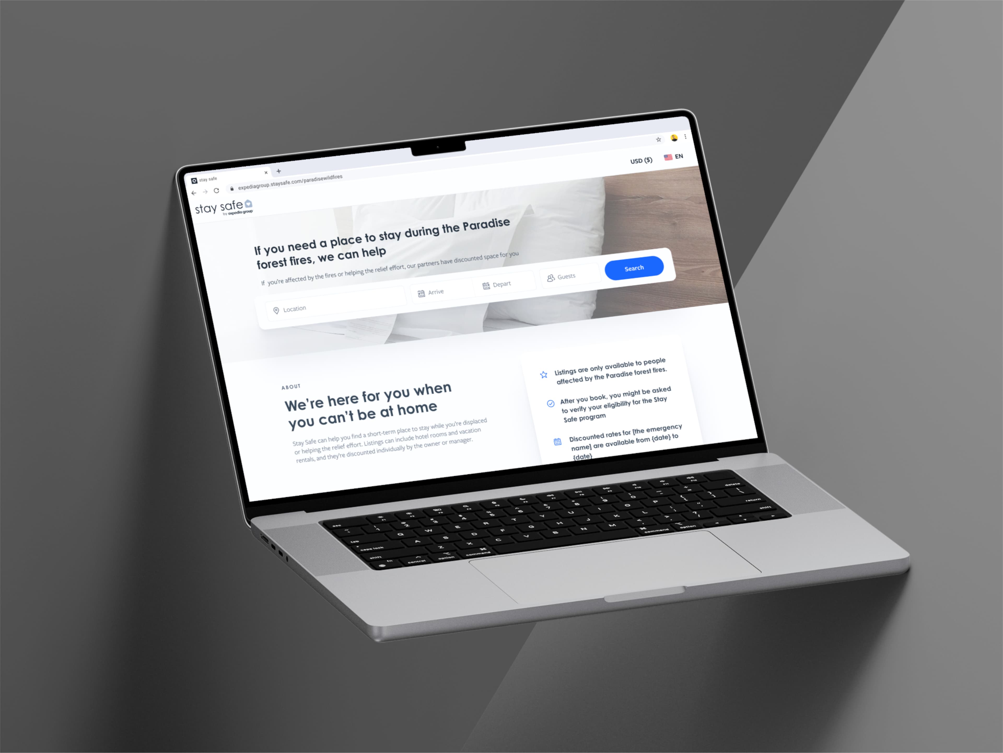
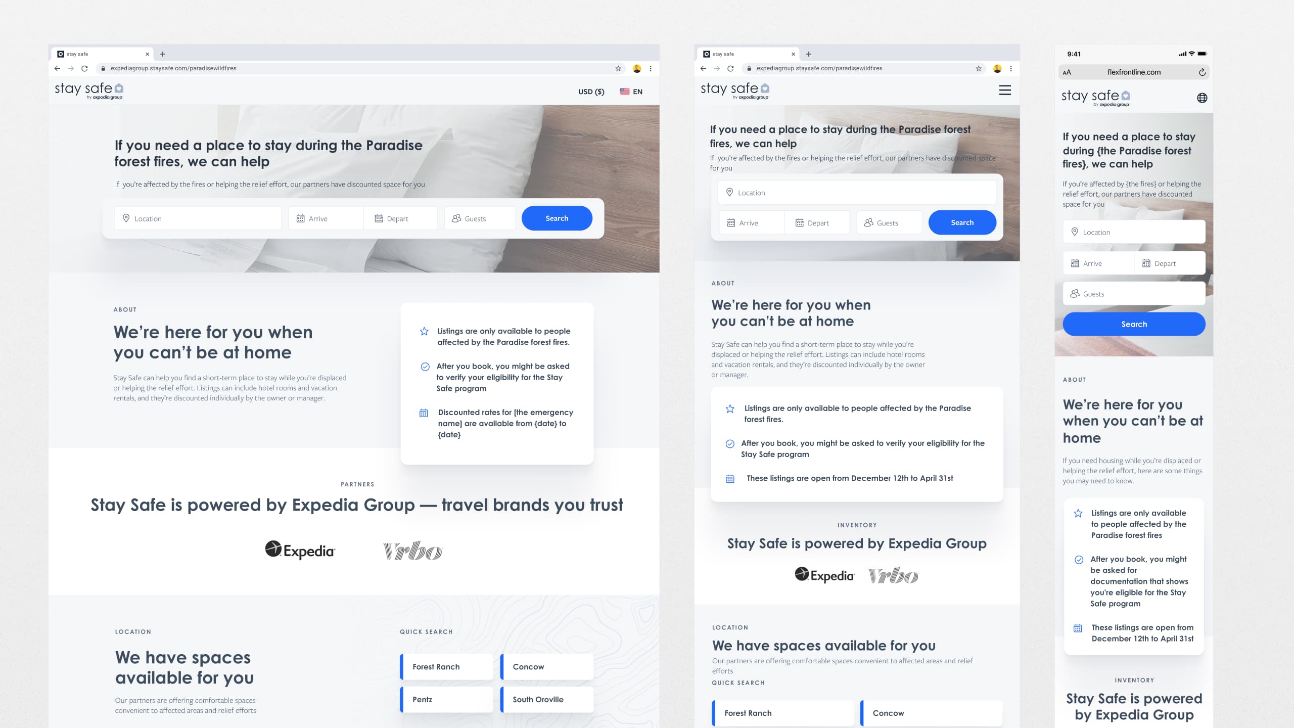
Stay Safe
Building on the success of Flex Frontline, we evolved the product into Stay Safe, a more comprehensive platform designed for future crises. The tool included features like disaster-specific landing pages, options for multiple accommodation types (hotels and vacation rentals), and partner opt-ins.
Project Shelving
Despite the significant progress made on Stay Safe, Expedia leadership ultimately decided to shelve the project after several months of development due to company-wide resource constraints following a large round of layoffs caused by the pandemic. While the project was put on hold, the work demonstrated our team's ability to pivot quickly and develop innovative solutions under pressure.